Lecture slide design
Students need to interact with the material in order to “encode” and “rehearse” the information. Without this it will be very difficult to recall it later. Making your own notes and drawings does this, so make lecture slides available for note taking, handouts should be in a form set up for note-taking, such as 3 slides to a page. This format has pictures of the slide end states on the left and lines for writing on the right. Students are far more likely to remember information from their own notes and drawings than from an instructor’s. They take ownership and customize representation of the content in ways that are meaningful for them and thus memorable.
Slide shows tend to put students into a passive, “entertain me” mode that results in little information retention. Also, if students can get the slides online, many may mistakenly think they have all the important content, and thus will magically be able to retrieve this information for tests and assignments without having to do anything other than read the slides. You need to explain why this won’t work, which is noted in the paragraph immediately above.
Memory works best when information is delivered in 10-minute chunks followed by immediate application (discussion, Q&A, notes consolidation), to help memory formation through consolidation. Consolidation includes figuring out how new information fits with students’ current mental models of the topic and refining those models or creating new ones if none currently exist. (Klemm, 122)
Show only a few slides at a time, limiting content to pictures and diagrams that would take too long to draw on the board, or illustrations that use animation. It is effective to have some slides with no text at all—pictures are far more memorable.
When the instructor draws and writes, it slows things down enough for students to think about it.
Slides can be interactive quizzes that require completion of a diagram, contain movie clips, have links to Web sites, use slide animation features to illustrate the in-between states, not just before and after.
Students can read much more quickly than the presenters can speak. This is why reading text from the screen does not work—it results in “dual channeling” where two primary modes of information absorption (reading and listening) compete with one another so that neither works (Stone, 360). Better to have illustrations and short text summaries or keywords with the details presented in the narration. Ensure that the written key words are the same as the spoken ones, rather than synonyms, to further reduce dissonance.
“To accommodate templates, authors must often distort real conceptual relationships, or consistently violate the template, which invalidates the notion of template” (Stone, 362). Break free from linear presentations. Hyperlink sets of slides to a menu, then link and move around according to student interest. Chunking breaks relationships between pieces of information. Use the slide show structure to reinforce information structure e.g., a graphic organizer with hot links and returns.
Consider how the PowerPoint structure affects the way students perceive and process the information. The linear structure, page templates and wizards “encourage a vacuous recital of reductive bullet points, while the projected display format minimizes the amount of textual or numeric information that can be communicated” (Cyphert, 185). “Authors trying to express logical relationships that are not similar to the default logic of PowerPoint must invest significant effort into working around the problem, if a work-around can be devised” (Stone 366). Some ideas for overcoming this are presented below.
For disciplines in which mathematical or quantitative application of central ideas is emphasized, instructors often need to repeatedly demonstrate step-by-step examples of how to apply models or churn through certain formulas. Having students see problems being worked out in real time—as they work along with the instructor—is often easily accomplished using other media such as a chalkboard, whiteboard, document camera, or overhead (Burke, 249).
Speak to the students, not the screen. Consider that it is likely students will make an assumption of a positive correlation between the number of slides on a topic and its importance.
Dim lights near the screen to avoid wash-out. Use the light switch system to raise and lower light levels between slide show and application activities.
A good diagram or graph can explain much better than text. However, “…teachers need to ask whether each picture, sound, or video clip furthers student learning or is extraneous fluff” (Rosenthal, 85).
Use visual consistency as an instructional aid (e.g., colours and styles for similar types of content). Avoid using canned templates and clip art. Three colors should be sufficient, however: one for the slide background, one for the text color, and perhaps one accent color.
Example visual slide that shows content organizational relationships:

Be careful with publisher-provided slides—some simply replicate textbook examples or just take the chapter headings and subheadings.
Don’t have too many slides in any one class. Don’t let PPT slides become the lecture—they should supplement the lecture. Engage students with the slides by:
- Having slide blanks to fill in.
- Presenting slide content as questions or challenges rather than statements.
- Including open-ended, thought-provoking and brainstorming slides.
- Assigning students to co-lead class lectures.
- Having topic slide summaries and questions to which students indicate their answer selections by hands or coloured cards or clickers.
More practical tips:


Assertion-visual evidence approach vs. title-bullet points
Consider a slide approach of assertion-visual evidence instead of title-bullet points. Two recent studies showed significant improvement in test scores using this method in Computer Science (Wolfe) and Geoscience (Diesel). The assertion-visual evidence approach more readily orients students to the purpose of the slides. Makes it easier to know where topics begin and end (Wolfe). Allows the instructor to clearly emphasize the most important point of the slide be giving that assertion more emphasis than it would receive in a bulleted list (if it were even there). Visual evidence follows findings from research that students learn better from relevant images coupled with words than from words alone. Also, from images placed close to, and represented simultaneously with, corresponding text. (Diesel, T2G-12)
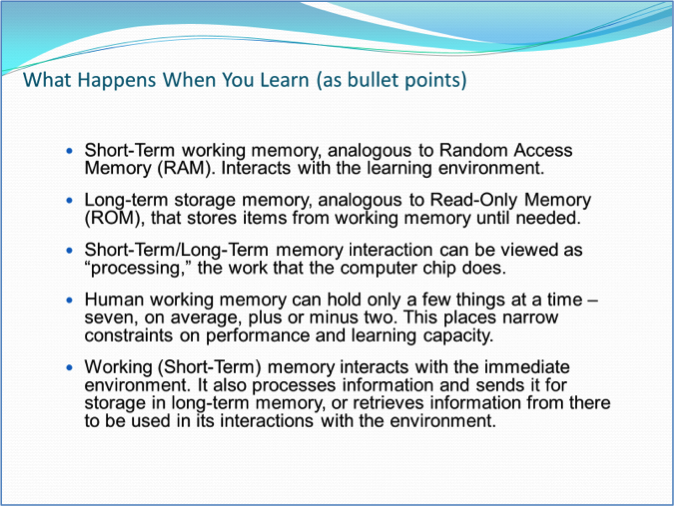
Title-bullet points approach ex.1:
Assertion-visual evidence approach using animations ex. 1: start

Assertion-visual evidence approach using animations ex. 1: end

Title-bullet points approach ex. 2:

Assertion-visual evidence approach using animations ex. 2: step 3 of 7 (mid-animation)

Assertion-visual evidence approach using animations ex. 2: end

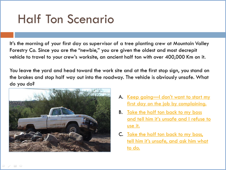
PowerPoint hotspot linking to create scenarios
This form of slide deck has an “ill structured” scenario (one in which relevant and irrelevant information is given without indicating which is which) and the response options represent typical reactions, the correct one of which is unclear. The three slides below show only the logic branch for picking response A each time. To create a scenario, first create a logic structure, then design slides for each part and link them back and forth with hotspots. The slide presentation then involves application, discussion, and deeper learning.
Scenario setup
Further scenario development after selecting response A:

The end of logic branch 1A:

End and back takes students back to the first slide so they can try again. This allows students to explore all options and reinforce the best one.
Have several scenarios in one slide deck with a linkable menu:

References
Burke, L. A., James, K. & Ahmadi, M. Effectiveness of PowerPoint-Based Lectures Across Different Business Disciplines: An Investigation and Implications, in Journal of Education for Business, 84:4, 246-251.
Cyphert, D. (2007). Presentation Technology in the Age of Electronic Eloquence: From Visual Aid to Visual Rhetoric in Communication Education, 56(2).
Diesel, E., Alley, M, Schreiber, M. & Borrego, M. (2006). Improving Student Learning in Large Classes by Incorporating Active Learning with a New Design of Teaching Slides. ASEE/IEEE Frontiers in Education Conference, Oct. 28-31, San Diego.
Downing, J. & Garmon, C. (2001). Teaching students in the basic course how to use presentation software inCommunication Education, 50(3).
Kinchin, I. M., Chadha, D.& Kokotailo, P. (2008). Using PowerPoint as a lens to focus on linearity in teaching,Journal of Further and Higher Education, 32:4, 333-346.
Klemm, W. R. (2010). Computer Slide Shows: A Trap For Bad Teaching in College Teaching, 24(2).
Rosenthal, G.T., Barlow, S., McKnight, R. R., Barr, J. E., Wilkinson, L. V., Buboltz W. C. Jr. & Von Bergen, C. W. (2003). Multimedia, It's How You Use It in Computers in the Schools, 19(3-4).
Stoner, M. R. (2007): PowerPoint in a New Key in Communication Education, 56(3).
Sugahara S. & Boland G. (2006). The Effectiveness of PowerPoint presentations in the Accounting Classroom, Accounting Education: An International Journal, 15(4).
Wolfe, C., Alley, M., & Sheridan, K. C. (2006). Improving Retention of Information from Teaching Slides. ASEE/IEEE Frontiers in Education Conference, Oct. 28-31, San Diego.